Poster layout
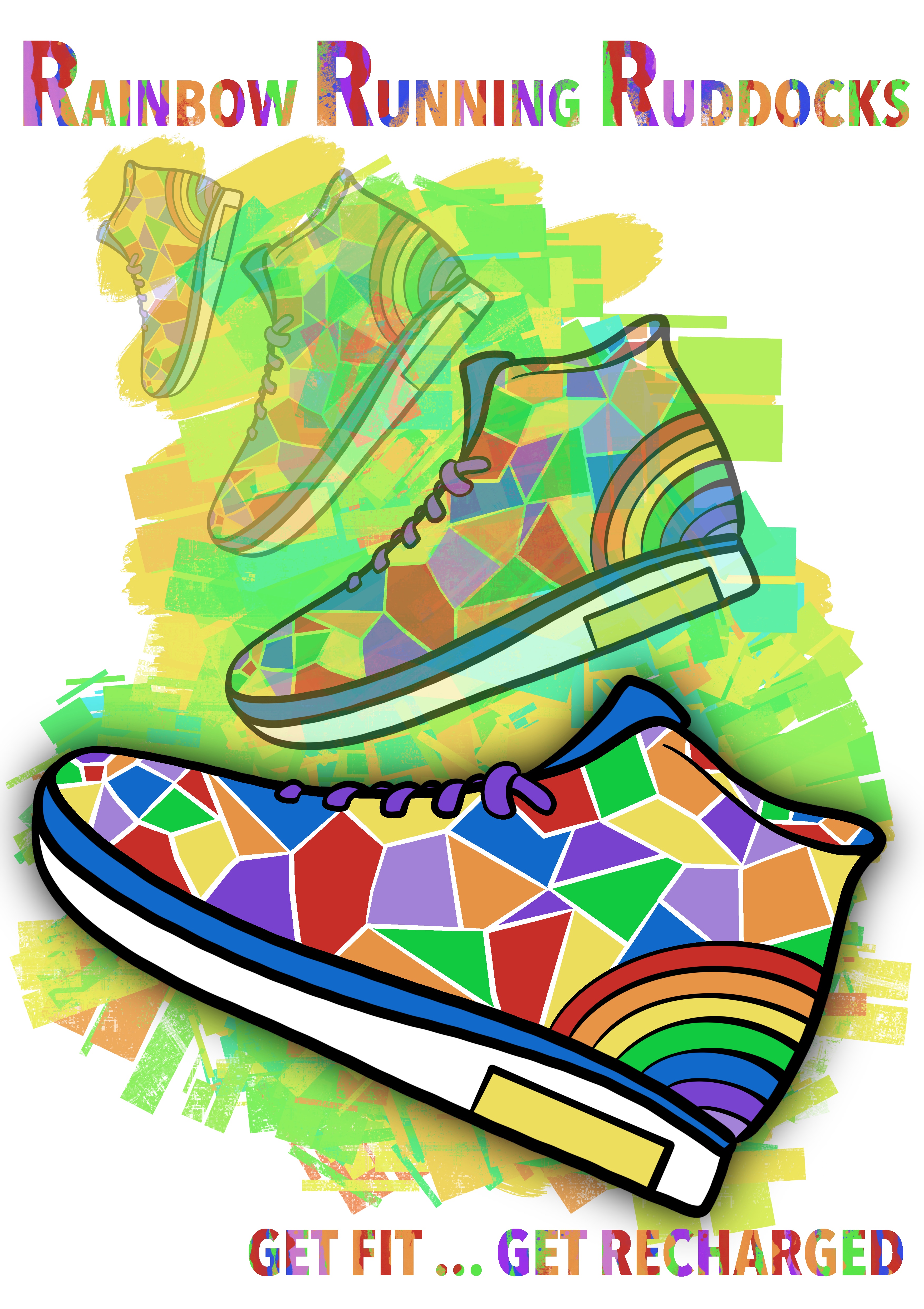
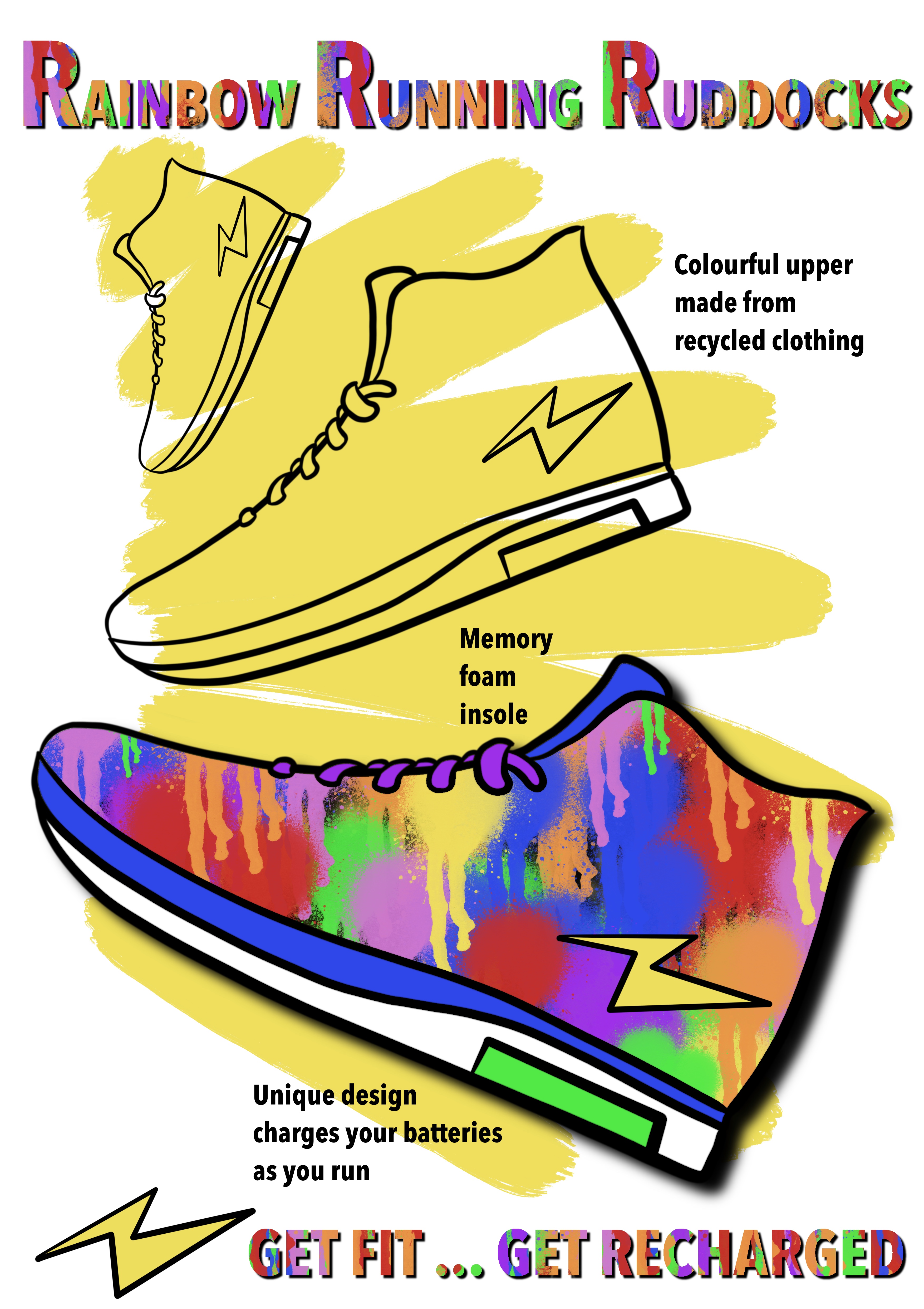
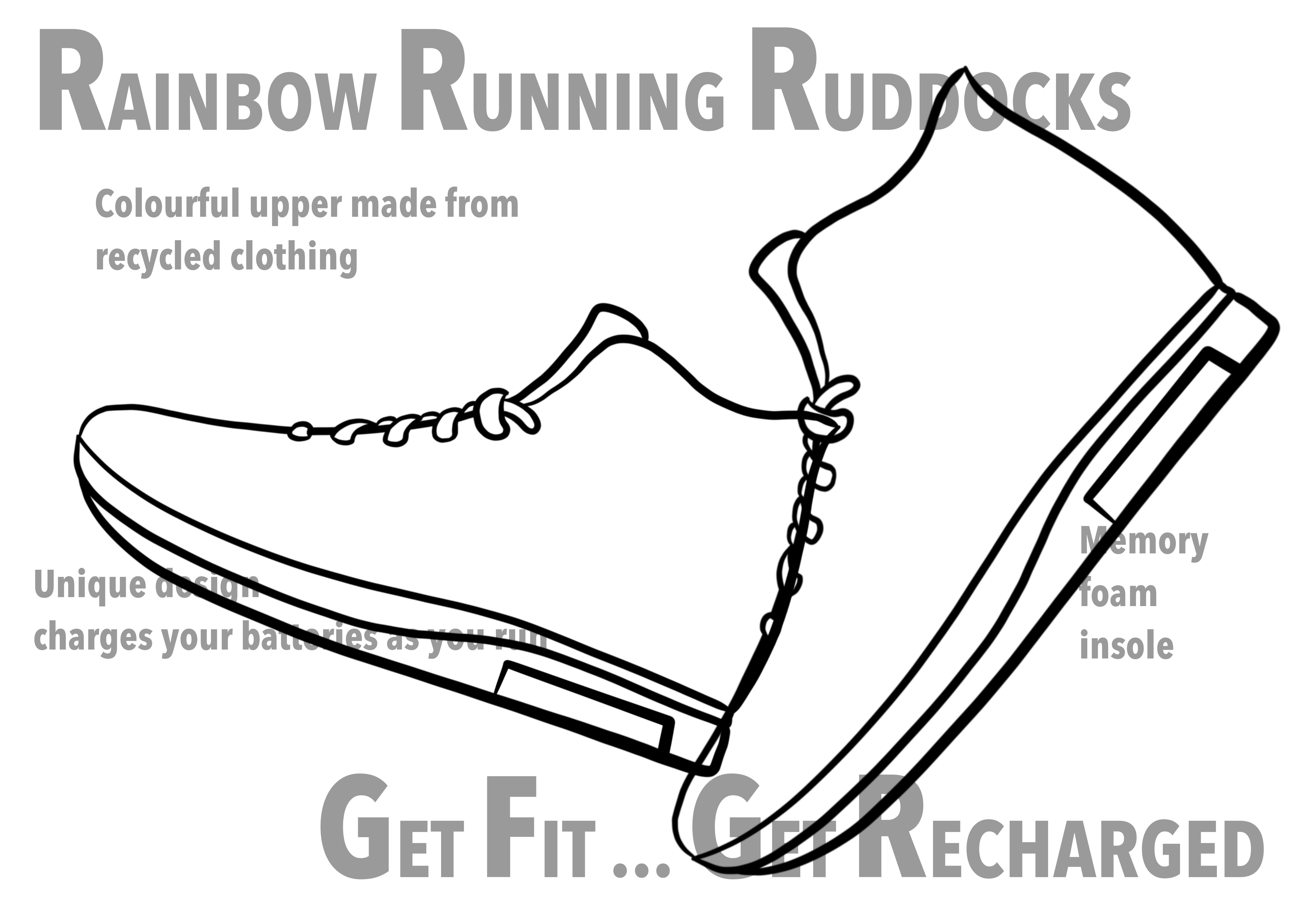
I've been playing around with poster layout ideas. I'm particularly interested in the use of repetition in a design to give a unified and consistent look. I'm also considering colour in the design. Colour theory and the psychology of colour are important in graphic design. Different colours can have a different response from a viewer. For example red, yellow and orange are associated with appetite and used a lot in food adverts. Blue is not a colour that occurs naturally in foods so would be off putting to customers - you wouldn't want to see blue fish fingers. Yellow is one of the most eye-catching colours - I've been using yellow as a bit of a base colour to push the product forward. Yellow can also be a bit overpowering and tiring on the eye, so in some cases, it needs to be used carefully. With regards to the Rainbow Running Ruddocks, I thought a boost of yellow energy is a good thing to include in the design. Another thought on colour, in a lot of graphic design it's good practice to limit your colour pallet - it makes a design clear and pleasing to look at. Bit with the Rainbow Running Ruddocks, I can't not have a rainbow, so it's important to be consistent with the use of colour to avoid a big colour assault! Which is why I'm bringing in the yellow. I'm still working on ideas for the logo - I don't like the paint splatter on all lettering - the words get lost and I don't notice them. I have a new idea. Final thing I need to decide on is the text - do I dot it about, which I like because it guides the eye to the point of the show that it refers to, but it looks untidy from a design point of view ... or do I align it all in one block so that the view isn't searching for it - got to think more on that.